![]()
Call-To-Action (CTA)
Back to Glossary

An apt call to action (CTA) button can increase your conversion rate up to 121% and CTA button that drive urgency can generate a conversion rate of 332%.
The sole purpose of a call to action button (CTA) is to encourage your target audience (TG) to take the next desired step. If used properly, it can benefit in many ways. Keep reading to find out more.
So let’s understand the what, why, and types of CTA buttons.
What is a Call To Action (CTA)?
A call to action (CTA) is like a push for your visitors to perform the next step. A CTA often consists of a simple message that tells you exactly what to do next.
For example, while browsing a website, when you see a button stating, “Download our free ebook!” that is a CTA. It indicates that the website invites you to take action and grab something exciting.
Call-to-action (CTA) buttons are very powerful. An effective CTA can significantly improve your online marketing results.

Types of CTA buttons
Based on your purpose and audience type, CTA buttons can be categorized into numerous categories. Some of the frequently used CTA buttons are mentioned below.
Lead Generation CTA
You can use the lead generation CTA button when you want to capture the lead data, such as email address, contact number, etc, in exchange for a lead magnet. You can also engage your audience and collect information through quizzes, feedback, or surveys.
Commonly used CTA buttons are “Sign Up for our Newsletter,” “Download our Free Ebook,” or “Get a Free Quote.”
Purchase CTA
You can use purchase CTA when you want the user to make a purchase or complete a checkout process. You can also create an urgency and FOMO with “Get yours before they’re gone!” CTA.
Commonly used purchase CTA buttons are “Buy Now,” “Add to Cart,” or “Shop Now.”
Content Engagement CTA
The content-related call to action buttons would encourage your users to learn more about your product or service, such as by reading a blog post, visiting a landing page, or watching a video.
Commonly used CTA buttons are “Read More,” “Learn More,” or “Watch Now.”
Social Sharing CTA
Using social sharing call to action buttons would encourage your readers to share your content with their friends and colleagues. This would help with the process of amplification of your content.
Commonly used CTA buttons are “Share on Facebook,” “Tweet This,” or “Pin It.”
Contact Us CTA
You can use the contact call to action button to encourage your visitors to gather more information about your business or to request any kind of assistance. These CTA buttons help with higher conversion by providing personalized consultation.
Commonly used CTA buttons are “Contact Us,” “Get in Touch,” ” Schedule a Demo,” or “Talk to an Expert.”
Form Submission CTA
When you use this call to action button, you encourage your users to take actions like submitting a form for a survey, registering, etc. This CTA would help your passive viewers to become active participants.
Commonly used CTA buttons are “Submit Now,” “Sign Up,” or “Register Today.”
Some action-oriented CTA buttons that you can make use of are:
- Download a file: “Get your copy of the whitepaper now” or “Download the free template.”
- Watch a video: “Learn more with our informative video” or “See how it works in action.”
- Attend an event: “Register for our upcoming webinar” or “Join us for the live workshop.”
- Take a quiz: “Test your knowledge and find out your score” or “Challenge yourself with our fun quiz.”
What are the benefits of a Call to Action (CTA)?
A call to action (CTA) is a helpful guide that removes all the confusion about what you want your audience to do next on your website. You can have multiple call to action buttons on your page, each offering different pathways for your audience to explore.
But remember not to keep too many, as it might confuse your audience.
Now let’s see what are the benefits you can get from a call to action (CTA) button.
Increased Conversions
This is the first and the most obvious benefit you can get from an effective and compelling CTA. Whether it’s signing up for a newsletter, making a purchase, or downloading a white paper, CTA buttons have the ability to drive conversions.
Improved User Experience
When you use clear and concise call to action buttons, you make it easier for your users to navigate through your website a worthwhile experience. When your website provides an awesome user experience, the chances of conversion increase.
Increase in Engagement
Using appropriate call to action (CTA) encourage your audience to get engaged with your content, follow you on social media, or participate in discussions; you can build stronger relationships and turn them into loyal customers.
Increase in Brand Awareness
A CTA has the ability to build brand awareness and recognition. When you use the same call to action buttons across your marketing materials, you can reinforce your brand message and make it easier for people to remember who you are and what you do.
Valuable Data and Insights
When you track the clicks on your CTA button, you get insights into how your target audience interacts with your content and what resonates with them. This data can help you to make informed decisions. In return, you can improve your marketing campaigns and optimize your CTA buttons for better results.
Clarity and Focus
Call to action buttons can help you communicate your desired action clearly to your target audience. It helps to remove ambiguity, which increases the chances of your users taking the next steps.
Flexibility and adaptability
Whether you are running an email campaign, designing a website landing page, or creating social media content, you can incorporate CTA buttons to drive conversions. Call to action buttons can also be adapted for various marketing goals and channels.
Cost-Effective Marketing
When you optimize your call to action button, you are focusing on converting existing website visitors; you can increase your revenue without necessarily investing in expensive advertising campaigns.
How to write an effective Call To Action (CTA)?
Writing a compelling call to action (CTA) is an art. It has to be persuasive, impactful, and tailored to your targeted audience.
Certain things you should keep in mind while writing a CTA are
Use of Action Verb
You should not settle for the mundane CTA button. Carefully choose your verbs that ignite curiosity and demand action. Try using “Get started”, “Discover Now”, “Sign up without credit card”, etc. Using these verbs gives the visitor more clarity and motivates them to take the next steps.
Make it Clear
You should not let ambiguity anywhere near your website. Your CTA should be a crystal-clear beacon, guiding users toward their desired destination – short, sweet, and to the point. Crafting a clear CTA cuts the excess noise & resonates with your audience.
Visually Appealing
Your call to action buttons shouldn’t blend with the background, they need to stand out and demand attention. Use contrasting colors, bold fonts, and striking visuals to make your CTA visual centerpiece of your content.
Voice and tone
Don’t let your CTA feel out of place. You should ensure it goes with the overall tone and voice of your website and content. If your content is casual, then your CTA should also be in the same tone. You should follow consistency throughout so that the user gets a seamless experience.
Strategic Positioning
You should not leave your CTA stranded at the end. You should strategically plan on placing your CTA throughout the content. You can use mini CTA button within the content that would act as a constant reminders, that would give a clear picture to the visitor on what is the next step expected from him.
Urgency and Scarcity
You can try to add a dash of urgency and scarcity to your CTA. You can use CTA buttons like “Limited-Time Offer,” “Only a Few Seats Left,” “Don’t Miss Out”, etc. which will create a ticking clock in the user’s mind. This would help them take the next step before the opportunity disappears.
Benefit-Driven
You should be able to highlight what are the benefits users will be getting from your product. Make the value proposition so that it would encourage them to take the next steps.
Appropriate length
Your CTA button should not be very long, as the user might lose interest in reading the entire sentence. You should ideally keep it between 3-6 words. It should be easy to scan, provide context & value, and create excitement.
Personalization
You can try to customize your CTA button based on the target audience’s data like location, behavior, preferences, etc. You can make use of dynamic content to create unique offers and landing pages.
Call To Action Examples
Hubspot

The CTA of Hubspot states, “Get started free” which is straightforward and action-oriented. It effectively captures leads interested in trying HubSpot’s marketing platform.
The CTA eliminates friction by offering a free trial, reducing barriers to entry, and encouraging immediate action.
Salesforce

The CTA “Discover more” sparks interest among the visitors and encourages them to get an in-depth understanding on what the tool has to offer.
The “Watch Demo” CTA allows visitors to experience the benefits and features of Salesforce firsthand. It also provides a consultative approach, guiding visitors toward making informed decisions.
Slack

The CTA “MEET SLACK FOR ENTERPRISE” shows that Slack directly invites businesses to learn more about Slack’s enterprise solutions and how they can benefit their organization. It redirects their visitors to a landing page that mentions all the benefits that an enterprise would look for.
The “TALK TO SALES” CTA encourages their visitors to contact Slack’s sales team to discuss their specific needs and get a personalized quotes. It offers a consultative approach by helping businesses choose the right solution for their needs and budget.
Dropbox

“Get Dropbox for work” CTA targets businesses and organizations, highlighting the benefits of using Dropbox for work collaboration and file sharing. The CTA clearly indicates its target audience, leaving no space for ambiguity.
The CTA “Get Dropbox for personal use” clearly mentions that the feature is targeted toward individuals who are looking for a reliable and secure way to store and share their personal files.
Zoom
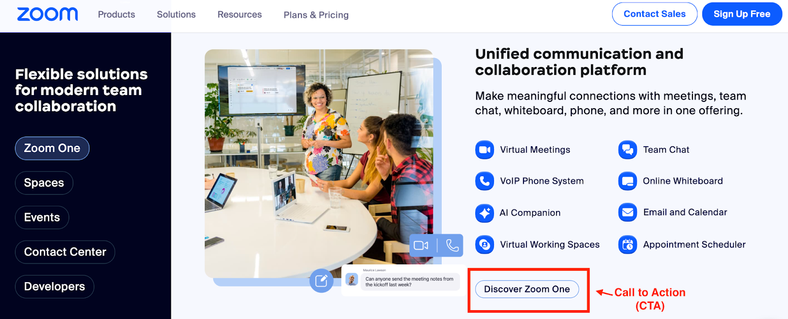
In the example, Zoom mentions all the features they have for the Zoom One plan, which is targeted towards businesses and enterprises. The CTA is placed just below the feature list, which encourages the users to learn more about that particular plan.
Adobe Creative Cloud
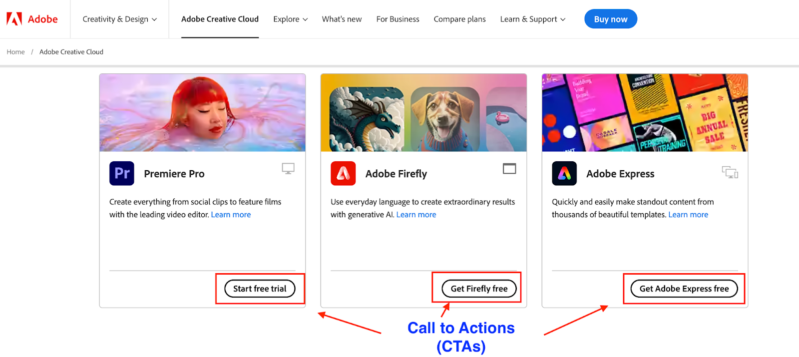
The CTAs shown in the image indicates that Adobe is using different types of call to action buttons based on the feature they are offering. The CTA button encourages users to try their product, allowing them to experience the value of the product or service firsthand before committing to a paid plan.
The Budgetnista

The CTA “GET MY GOODIES” is quite an impressive way of encouraging visitors to sign up for the weekly newsletter. The CTA sounds way more interesting than the regular “sign up for newsletters,” etc. The chances of conversion increase when you use some catchy CTAs.
Take Away
You can find CTA button everywhere, and they are there for a reason: to encourage you to take action. They are like guides, helping you to navigate through content & find what you are looking for.
You can experiment with different CTA variations to discover what resonates best with your audience and constantly refine your approach.
Remember, a successful CTA is more than just a button; it’s the start of a conversation, a bridge to deeper engagement, and, ultimately, a catalyst for achieving your marketing goals.