![]()
How to Balance Images and Text to Keep Emails Out of Spam?
A couple of years ago, at the start of my career, I was working on a feature launch announcement. I spent about 1.5 hours designing the perfect product announcement email.
I added 2 stunning photos, crafted compelling copy, and hit send to an email list of odd 3000 users.
The result?
Only 650 users opened that email.
The rest landed in spam folders.
I made a terrible mistake and learnt my lesson from it.
And surprisingly, it is very common with email-marketers.
Most email marketers don’t realize that beautiful, image-heavy emails often trigger the same spam filters designed to catch actual scammers.
And balancing images and text is no more just about aesthetics – it directly impacts your email deliverability and inbox placement
In this guide, we’ll explore everything from ideal image-to-text ratios to practical tools you can use, backed by expert insights and real-world tips.
Why your beautiful emails keep landing in spam folders?
Most beginners think spam filters only care about who sends the email.
That’s only part of the story.
Modern email spam filters use artificial intelligence to analyze your email content.
They look for patterns that match historical spam tactics.
Back in the early 2000s, spammers discovered they could hide promotional text inside images to bypass text-based filters.
So they used to create emails that were 90% images with very little readable text.
Spam filters learned to flag this pattern.
Fast forward to today, and your email sequences, newsletters and even legit cold emails with images looks suspiciously similar to those old spam emails.
Spam filters assume that emails with more images than text might be hiding malicious or misleading content.
This is especially true if your images include CTAs or promotions without any explanatory text.
Why balancing images and text matters for email deliverability?
Spam filters use complex algorithms to scan email content.
According to Litmus’s 2024 State of Email Report, 43% of emails are flagged by spam filters due to poor image-to-text ratios.
ISPs like Gmail use machine learning algorithms that specifically evaluate content balance, as documented in Google’s Email Sender Guidelines
These filters look at elements such as:
- Image-to-text ratio: Too many images and not enough text? That’s a red flag.
- Use of HTML: Overly designed emails with bloated HTML can raise suspicion.
- Missing alt text: Images without descriptions are often treated as blank space.
There are more elements to it, which we have discussed in a separate article.
Check out: Why Image-to-Text Ratio Impacts Email Deliverability
What is the Ideal Image-to-Text ratio for emails?
A commonly recommended approach is the 60% text to 40% image ratio.
This balance helps maintain deliverability while keeping the design visually appealing.
Getting this ratio right can improve how your email renders across clients, how fast it loads, and how spam filters treat it.
However, depending on your audience and the type of message you’re sending, some campaigns may benefit from a 70/30 or even 80/20 ratio.
A properly balanced email signals to spam filters that your content is legitimate, informative, and accessible.
Curious about how to adjust your ratio based on your audience and campaign goals?
Read our detailed blog on the ideal image-to-text ratio in emails.
How to balance images and texts to keep emails spam-free?
Here are some ways to strike the right balance in text to image ration for emails and dodge the spam folder:
Tip #1 → Stick with Clear, Lightweight Images
Choose JPEG or PNG formats with compressed file sizes under 150KB.
Use tools like TinyPNG or Squoosh to minimize image weight without sacrificing quality.
Heavy images can delay loading and trigger spam filters — especially on mobile devices.
💡 Real-life tip: In one of our feature announcement emails saw a 30% boost in inbox rate after replacing the main hero banners with two smaller product snapshots and tighter compression.
Tip #2 → Follow the 60/40 Rule — But be flexible
A 60% text and 40% image layout gives your emails balance and helps spam filters interpret context.
That said, this isn’t a rigid rule.
Try 80/20 for cold outreach, where clarity and scannability matter most.
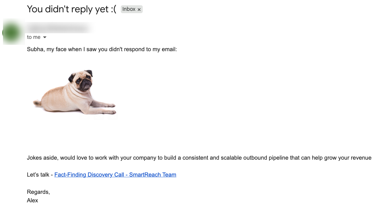
*Example of a B2B cold email with good image to text ratio
B2C promotional emails can safely push to 50/50 if you support visuals with text.
Tip #3 → Make every image count in the email
Don’t use decorative images just for aesthetics.
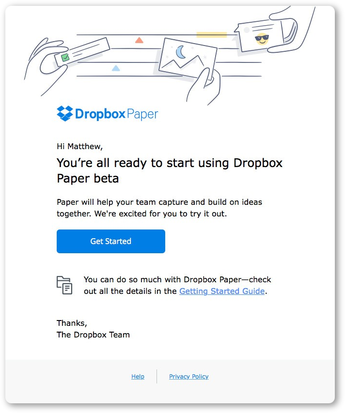
Every image should support your message — product shots, infographics, or customer testimonials in image form are good uses.
Tip: Include a text-based explanation or caption for each key visual.
Tip #4 → Alt Text = accessibility + deliverability
Write descriptive alt text for each image. It helps spam filters understand your content.
When your image fails to load, alt text gives context.
✅ Example: “Tap here to explore our summer collection with 30% off deals.”
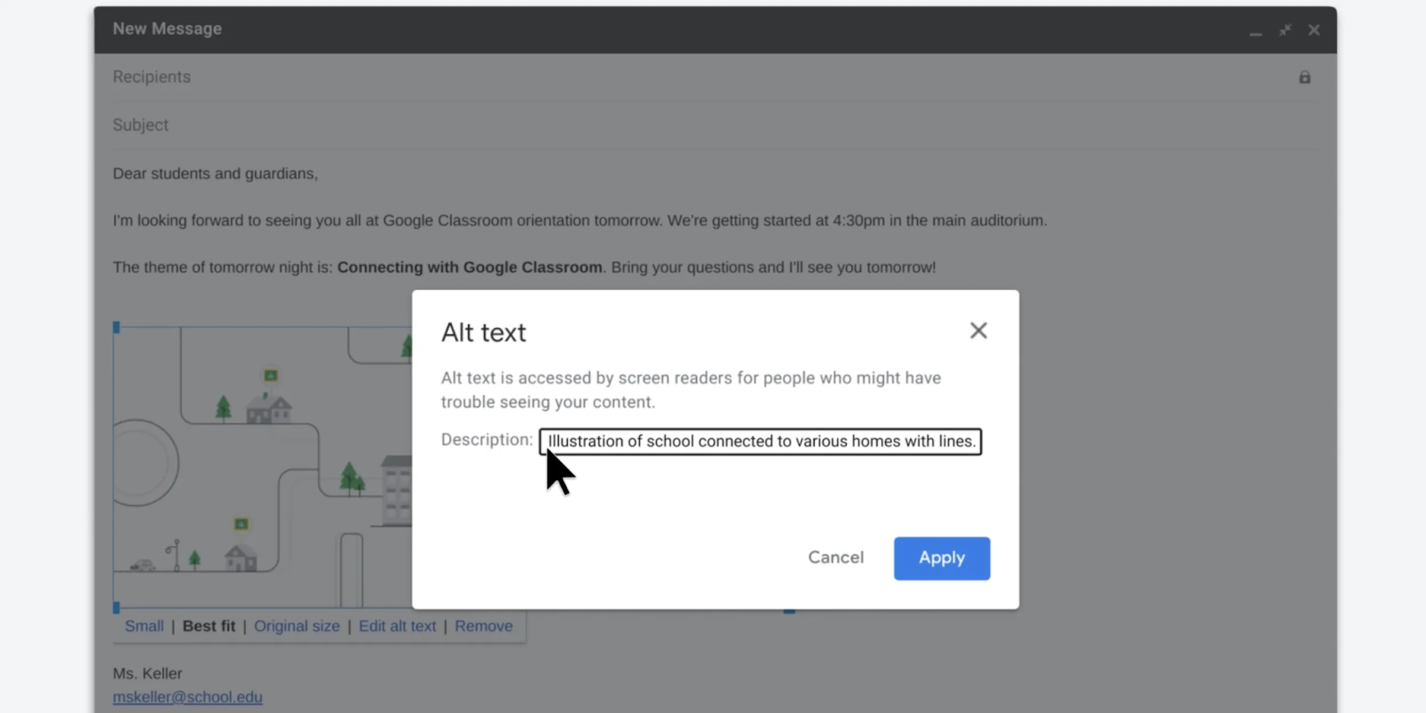
Checklist for writing perfect alt text:
- Describe the image purpose, not just what it looks like
- Keep it under 125 characters
- Insert a natural keyword, only if it fits
Tip #5 → Don’t hide your CTA in an Image
Many email marketers unknowingly bury their primary email CTA (like “Shop Now”) inside an image.
Big mistake.
Instead, use HTML buttons and back them up with plain-text links.
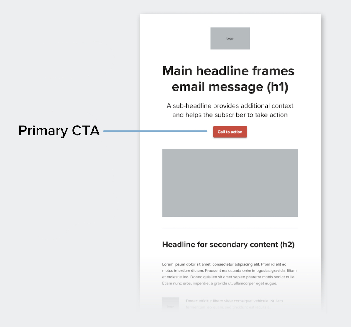
Brands using HTML-based buttons usually sees better mobile engagement and fewer rendering issues on Outlook.
Tip #6 → Structure the email for mobile first
Use a clear visual hierarchy:
- Start with a short text intro
- Follow with a strong supporting image
- Add value-rich text blocks below
- Wrap with a clear CTA
Spacing, padding, and readable fonts matter more than flashy visuals when it comes to keeping users engaged.
Split your email into modular blocks with images next to or under the text.
Avoid giant hero images that carry all the weight.
💡 Pro tip: Test 2-column layouts where the left side has product visuals and the right includes benefits or quotes.
Tip #8 → Always include a plain-text backup
Some recipients (especially in B2B) prefer or default to text-only emails.
Include a plain-text version to avoid spam penalties and maintain accessibility.
Quick win: Use SmartReach AI to generate personalized email sequences for B2B campaigns.
Tip #9 → Choose lightweight & compatible image formats
Stick with JPEG and PNG formats.
These are universally supported and provide a good balance between quality and file size.
- Avoid formats like BMP, TIFF, or unnecessary GIFs.
- Use modular images (multiple smaller visuals) instead of heavy hero banners.
Emails with heavy or unsupported images often suffer from rendering issues on clients like Outlook or Gmail, causing them to be filtered out.
Tip #10 → Compress images without losing quality
Large images increase load time and raise red flags.
Compressing images boost mobile load speeds and maintain design quality.
Compress images to stay under 150KB using tools like:
Tip #11 → Maintain the 60/40 Rule — but test!
A 60% text to 40% image ratio is ideal.
This balance ensures content is informative and visually appealing without overloading the spam filter.
But it’s always recommended to A/B test email copies with 70/30 and 80/20 variations depending on the industry.
B2B emails usually perform better with less imagery, while B2C brands can use slightly more visuals if supported by text.
Tip #12 → Break up content with visual hierarchy
Rather than stacking blocks of text or images, break your email into visual sections:
- Header (text + logo)
- Image block with text caption
- Feature text blocks with supporting icons
- Footer with contact details and plain links
This layout keeps users engaged and improves skim-readability, especially on mobile devices.
CTAs embedded inside images often get blocked. Instead:
- Use HTML-based buttons
- Provide text links as backups
From a Deliverability Summit hosted by ActiveCampaign, many experts emphasize this as a core fix for emails flagged by Gmail and Outlook.
Tip #14 → Use background colors and padding smartly
Instead of designing an email like a landing page, add visual appeal using background colors, dividers, and padding — all in code.
This helps reduce dependency on large image files.
Tip #15 → Test email copies across devices and email clients
Don’t just preview your email. Test the email copies:
- On different email clients (Gmail, Outlook, Yahoo)
- On mobile and desktop
- Using tools like Litmus, Email on Acid, or mail-tester.com
These tools flag rendering issues and give deliverability scores — crucial before hitting “Send.”
Conclusion
Balancing images and text isn’t optional if you want strong email performance.
Use a 60/40 ratio, always include plain-text versions, optimize your visuals, and test relentlessly.
These tactics boost not just your deliverability, but your user experience too.
Before every send, run your email through tools like mail-tester.com to spot problems early.
Frequently Asked Questions (FAQ)
Q. Do images in emails always trigger spam filters?
No. Images only raise flags when there’s too little accompanying text or no alt text.
Q. What’s the best image-to-text ratio for my industry?
Start with 60/40, then test 80/20 or 70/30 depending on your results and reader behavior.
Q. How do I know if my emails are landing in spam?
Use seed testing, track engagement, and check spam complaints using tools like mail-tester.com.
Q. Can I send image-only emails if my brand is established?
Technically yes, but it’s risky. Even trusted brands face rendering issues and accessibility problems.
Do images in emails always trigger spam filters?
No. Images only raise flags when there’s too little accompanying text or no alt text.
What’s the best image-to-text ratio for my industry?
Start with 60/40, then test 80/20 or 70/30 depending on your results and reader behavior.
How do I know if my emails are landing in spam?
Use seed testing, track engagement, and check spam complaints using tools like mail-tester.com.
Can I send image-only emails if my brand is established?
Technically yes, but it’s risky. Even trusted brands face rendering issues and accessibility problems.