Why does the image-to-text ratio in email affect deliverability?
On this page
One common mistake sends thousands of emails straight to spam everyday—and most people don’t even know they’re doing it.
Yes, it’s using too many images in the emails.
Most email marketers don’t realize that too many images and too little text can trigger spam filters—hurting email deliverability rates significantly.
Popular email service providers like Gmail, Outlook, and Yahoo don’t just care about how your email looks.
They care about whether it follows certain rules that help them decide if your email is trustworthy or spam.
One of the most important rules?
The ratio of images to text in your emails.
In this article, we’ll break down what image-to-text ratio means, how it affects your email campaigns and how to optimize your emails for maximum inbox placement.
TL;DR: How to fix a bad image-to-text ratio (Checklist)
What is the image-to-text ratio in emails?
The image-to-text ratio refers to the proportion of visual content (images, banners, icons, etc.) compared to written content (subject lines, body copy, links, etc.) in your email.
Let’s say your email is 1000 characters long:
- If 700 characters are from image blocks and 300 from text, that’s a 70:30 image-to-text ratio.
- If only 400 are from images and 600 from written text, your ratio is 40:60—which is what most experts recommend.
💡 Ideal ratio for safe email deliverability: Keep image content at or below 40%, and ensure 60% or more is text-based.
- Poor ratio example: An email that’s mostly a large promotional banner with just a small “Unsubscribe” link at the bottom. Maybe 90% images, 10% text. ❌
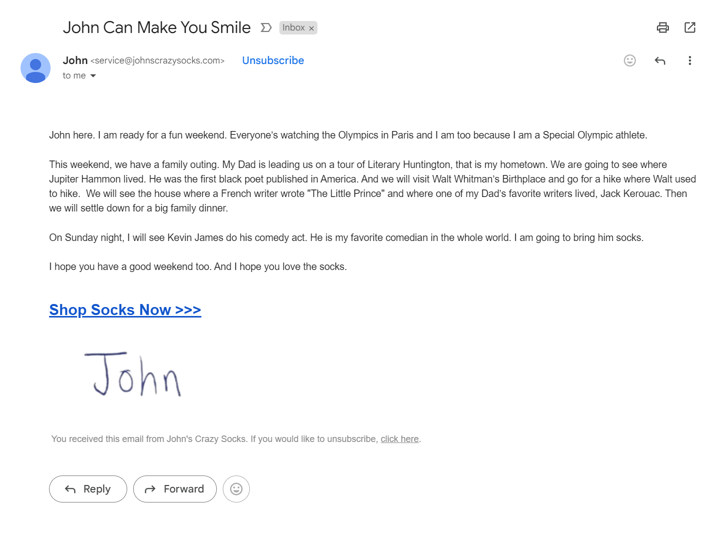
- Good ratio example: An email with a header image, product photos, but also detailed descriptions, customer testimonials, and clear call-to-action text. Perhaps 20% images, 80% text. ✅
💡 Note: You don’t need to be technical to understand this. Email platforms calculate this automatically in their system.
How does image-to-text ratio impact email deliverability?
When you send an email, it doesn’t go directly to someone’s inbox.
It passes through several checkpoints first.
The image-to-text ratio is one of the first things these security systems check.
Here’s why that ratio is so important:
1. Spammy emails often hide text inside images
Many malicious or overly promotional emails use images to “hide” text from spam filters.
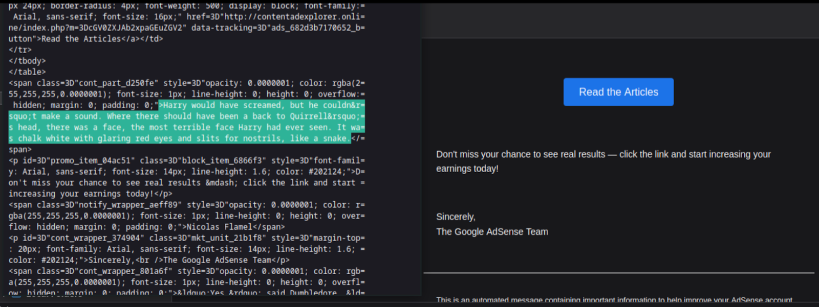
They’ll upload a graphic containing the sales pitch, CTAs, and discount offers—so spam filters can’t read or analyze the actual content.
Because of this tactic, email filters are trained to flag emails with excessive image use as suspicious—even if your intent is genuine.
📌 Example: Imagine a scammer sending a fake banking message that’s just an image. No filter can read what’s in the image—making it risky.
2. Too little text means less context
Email spam filters rely on text to understand an email’s purpose.
When there’s little or no written content:
- Filters struggle to analyze intent.
- Important cues like email personalization, topic relevance, and tone are missing.
- That uncertainty increases the risk of the email being marked as spam.
3. Poor user experience = Lower email engagement
Many email clients block images by default.
If your email relies solely on visuals, your readers may see:
- An empty email
- A grey placeholder with “image not loaded”
- Or worse, nothing at all
When that happens:
- Users don’t engage
- Email Open and click-through rates drop
- Email deliverability suffers as email services interpret it as disinterest
4. Mobile optimization becomes a challenge
Over 60% of emails are opened on mobile devices. Large image-based emails:
- Load slowly on mobile
- Use more data
- Break formatting
- Create pinch-and-zoom fatigue
All of which leads to frustration and lower interaction hampering the email deliverability.
What’s the ideal image-to-text ratio for emails?
Let’s get specific.
What ratios actually work in the real world?
Industry testing has identified two main approaches that consistently deliver good results. –
The 60:40 rule
This conservative approach suggests 60% text and 40% images in your emails.
This ratio works well for:
- Newsletter campaigns
- Product announcements
- Educational content
- B2B communications
When you use this ratio, you’re playing it safe.
Email filters rarely flag these emails as suspicious because there’s substantial text content to analyze.
📌 Example: A weekly newsletter with a header image, one product photo, and the rest being article text, descriptions, and customer quotes.
The 80:20 rule
This is the most commonly recommended ratio: 80% text, 20% images.
This approach gives you the best of both worlds:
- Strong email deliverability performance
- Enough visual elements to keep emails engaging
- Plenty of text for filters to analyze positively
Most successful email marketers aim for this balance.
It allows for a logo, maybe a product image or two, but keeps the focus on text content.
📌 Example: An email promoting a sale with your logo at the top, one featured product image, and detailed text describing the offer, benefits, and customer testimonials.
7 Tips to maintain a healthy image-to-text ratio for email campaigns
Here are some practical ways to balance images and text.
Tip #1 → Use descriptive alt text
Every image in your email should have alt text. This serves two purposes:
- It helps people with visual impairments understand your content
- It counts toward your text content for deliverability
Example:
- Good alt text: “Red leather handbag with gold hardware, model XZ-2024” ✅
- Poor alt text: “Image” or leaving it blank ❌
The descriptive alt text adds meaningful content that both humans and filters can understand. (e.g., discount, feature, or use case)
Tip #2 → Avoid embedding text in images
This is a common mistake that hurts deliverability.
Many businesses create beautiful graphics with text overlay, then use those as their main email content.
The problem?
Filters can’t read text that’s embedded in images.
To them, it’s just a picture.
Instead of creating a graphic that says “50% Off All Products This Weekend,” use HTML text for that message and include a supporting image separately.
Tip #3 → Balance visuals with text
You don’t have to choose between attractive emails and good deliverability.
Here’s how to have both:
- Start with text: Write your key messages in HTML text first. Then add images to support and enhance that content.
- Use captions: Add text descriptions below product images. This provides value to readers while improving your ratio.
- Include testimonials: Customer quotes are excellent text content that also builds trust.
- Add product descriptions: Don’t just show products in images. Describe their benefits in text.
Tip #4 → Prioritize HTML text for key messages
Your most important information should always be in text format, not images. This includes:
- Your main offer or value proposition
- Pricing information
- Contact details
- Call-to-action buttons (use HTML buttons, not image buttons)
This ensures your key messages get delivered even if images don’t load properly.
Tip #5 → Avoid image-only email templates
After analyzing delivery patterns across different industries at SmartReach.io, we noticed that B2B emails actually work better with lower image ratios (up to 20%), likely due to different filtering algorithms and user expectations
Never send an email that is just one big image. Always include:
- Intro text
- A clear CTA in HTML
- Footer and unsubscribe links in text form
Tip #6 → Use buttons (Not Image CTAs)
Instead of placing your call-to-action inside an image:
- Use HTML buttons
- Style them with brand colors
- Make them mobile-friendly
Tip #7 → Always test deliverability before you send the campaign
It’s always a good idea to check any possible deliverability issue before you send the campaign out to the prospects/users.
Use tools to scan your email for image-to-text issues:
- Mail-Tester.com for newsletter campaigns
- Folderly for text based email campaigns
4 Best practices for adding images in email campaigns
You can still create visually appealing emails while following ratio guidelines. Here’s how to use images effectively.
1) Choose the right image formats
Stick to standard formats that work reliably across email clients:
- JPEG: Best for photos and complex images with many colors
- PNG: Good for logos, simple graphics, and images needing transparency
- GIF: Useful for simple animations (use sparingly)
Avoid newer formats like WebP that some email clients don’t support well.
2) Optimize image sizes
Large image files can hurt both deliverability and user experience.
A) File size guidelines:
- Individual images: Under 100KB when possible
- Total email size: Under 100KB for best performance
B) Dimension guidelines:
- Email width: 600-800 pixels maximum
- Images should fit within this width
Smaller, optimized images load faster and create better experiences for your recipients.
3) Ensure mobile responsiveness of the added images
More than half of emails are opened on mobile devices.
Your image strategy needs to work on small screens.
Tips for making images mobile responsive:
- Images should scale down appropriately
- Text must remain readable at small sizes
- Touch targets should be large enough for fingers
This is another reason why text content is so important.
It’s always readable on any device.
4) Enhance accessibility of the images
Making your emails accessible improves both user experience and deliverability.
Accessibility practices:
- Always include descriptive alt text
- Use sufficient color contrast
- Don’t rely solely on images to convey information
- Include text versions of important visual content
These practices help everyone read your emails while also improving your image-to-text ratio and avoid sending your emails to the spam folder.
Conclusion
The image-to-text ratio in your emails directly affects whether your messages reach your customers’ inboxes.
While beautiful design matters, it must be balanced with sufficient text content to pass through spam filters successfully.
If you’re running cold outreach campaigns or nurturing email sequences, SmartReach.io helps you automate and optimize every campaign.
Why SmartReach.io?
✅ Auto SPAM Test checks for high-risk image-to-text ratios and spam triggers.
✅ SmartReach AI suggests subject lines, CTAs, and body copy to increase text balance.
✅ Deliverability related reports track opens, clicks, and bounces so you can adjust instantly.
SmartReach doesn’t just send emails—it helps your cold emails land in the inbox.
Your customers can’t buy from emails they never see.
Make sure your messages reach their inboxes by respecting the simple but crucial balance between images and text.
Try SmartReach.io for free (no credit card required)
Frequently Asked Questions (F.A.Q.)
What is a good image-to-text ratio for email?
A good image-to-text ratio is 60% text and 40% images, or even better—80% text and 20% images. This ensures better inbox placement and keeps your emails from being flagged as spam.
Do too many images in emails affect deliverability?
Yes, too many images and too little text can trigger spam filters. Emails with a poor image-to-text ratio are often flagged as suspicious and may land in the spam folder.
Why are emails with only images considered spam?
Spam filters can’t read text embedded in images. So, image-only emails lack readable content, making them look suspicious and increasing the risk of being blocked or sent to spam.
Can I include images in cold emails?
Yes, but use them sparingly. Stick to 1–2 small, optimized images and make sure the rest of your email contains well-written HTML text for better deliverability and engagement.
What tools help test image-to-text ratio in emails?
Use tools like Mail-Tester.com or SmartReach.io to scan and analyze your email content. These tools highlight deliverability issues, including poor image-to-text ratios, before you hit send.
Does alt text improve email deliverability?
Yes, adding descriptive alt text improves accessibility and contributes to your overall text content. This helps spam filters better understand your email and boosts inbox placement.
What happens if email images don’t load?
If images don’t load, recipients may see a blank email. This hurts engagement and increases spam complaints. Always include supporting text so your message is clear without images.
What image formats are best for emails?
Use JPEG for photos, PNG for logos or transparent images, and GIF for small animations. Avoid formats like WebP, which are not supported by all email clients.
Should I use image-only email templates?
No. Avoid image-only templates. Always include a mix of HTML text, proper CTAs, and readable content to pass spam filters and ensure your message is seen.
Stop juggling tools
Book more meetings on every channel
Join 5,000+ teams running multichannel outreach from one sequence, with deliverability built in.